Your packaging plays an essential role in attracting customers and persuading them to buy your products. Size, shape and material are a big part of packaging design, but perhaps the most crucial element is colour.
In this blog post, we look at the best colours for your packagingand examine the trends to look out for.
Why are colours important in packaging?
What are your brand colours? Do you have a colour palette? If you have a set of brand colours, then it makes sense to use them in your packaging.
At its core, colour is one of the most recognisable parts of a brand. Using it consistently across every touchpoint, including packaging, can increase brand awareness and recognition.
Colour has an emotional element that makes it a powerful part of packaging design. The right colour can help your product stand out on a crowded shelf and persuade customers to choose your product over your competitors.
The colours your choose for your packaging can help you tell your brand’s story effectively. This is critical for online stores because it’s one of the few opportunities they have to engage physically with their customers.
What is the best colour for packaging?
When it comes to picking a colour for your packaging, think about your brand colours first. Applying your brand consistently across every touchpoint is an effective way of raising awareness.
Consider also that colour affects how consumers think and feel about a product – this is known as colour psychology, and it’s used successfully by the country’s most well-known brands.
The bold red and cheerful yellow arches of Mcdonald's evoke a feeling of excitement. In comparison, the Amazon logo relies on a friendly and confident orange.
What does colour say about your brand? Here’s our quick guide to colour and emotion:
- - Yellow is welcoming and has a strong feeling of cheerful optimism.
- - Red is a bold, passionate colour that evokes strength and warmth.
- - Purple is imaginative and creative; it’s also associated with royalty.
- - Blue is a trustworthy colour that is associated with logic and intelligence.
- - Green is closely connected with sustainability, peace and health.
A combination of colours can change a consumer's thoughts and feelings about a brand or product.
Consider the contrast between the colour of your design and the colour of your packaging. For example, a purple or black design against a lighter-coloured box can feel luxurious.
A Kraft mailing box works well with a one-colour design to create a feeling of sophisticated minimalism.
The colour trends to look out for in 2023
Last year, bold contrasting colours were a big hit and that trend is set to continue this year, but if everyone is using the same bright colours, how do you make your packaging stand out from the crowd?
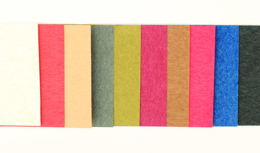
Some brands have chosen to use vibrant neons and highly saturated colours to give their packaging an edge. If this doesn’t fit with your brand, you can draw attention by doing the opposite and using muted colours for a toned-down, minimalist look and feel.
If you’re still looking for inspiration, have you considered Pantone’s colour of the year?
Pantone Colour of the Year
Viva Magenta is 2023’s colour of the year, as chosen by the people at the Pantone Colour Institute. This vibrant colour descends from red and is rooted in nature. Bright, bold and robust, it evokes a feeling of power.
Magenta is part of an earthy set of tones that is complemented by shades like pale dogwood, gray sand, pale khaki, and fields of rye.
Does colour increase brand recognition?
Colour is an essential parts of a brand’s visual identity. It’s a memorable hook that helps with brand recognition. In some cases, colour is so intrinsically linked to a logo that a brand is instantly recognisable by its colours without any other clues.
EBay, for example, has a very distinctive combination of red, blue, yellow, and green that you would know without the typography to go with it. The same could be said for Ikea, which uses the characteristic blue and yellow from the Swedish flag.
In the case of Ikea, the colour of its packaging isn’t the only consideration that has gone into its design. The size, shape, and material are all important, but sustainability is also key to its brand.
Sustainable packaging is in demand as brands attempt to show their commitment to protecting the environment. If you’re looking for something recyclable, coloured cardboard gift boxes and paper bags are both popular options.
You can read more about this in our article on the practical uses of eco-friendly packaging.
Colours for packaging – the bottom line
When it comes to packaging, colour plays an important role. It can change the way people think and feel about your brand and has the power to make shoppers stop and look at your product.
Colourful packaging makes your brand attractive and memorable, which is not only essential for making sales but also for remaining at the forefront of the consumer’s mind, so you’re the first thing they think about when they need your product again.
For ecommerce businesses, packaging is an essential marketing touchpoint that can help you tell your brand’s story. It’s also an opportunity to make the unboxing experience exciting and, importantly, sharable.
In 2023, you can expect to see more bold colours like Pantone’s Colour of the Year, Viva Magenta. But if this doesn’t fit with your corporate colour palette, consider creating a contrast between the colour of your packaging and its printed design.
All of this will help you stand out from the crowd, attract customers, and persuade them to buy from you again and again.


